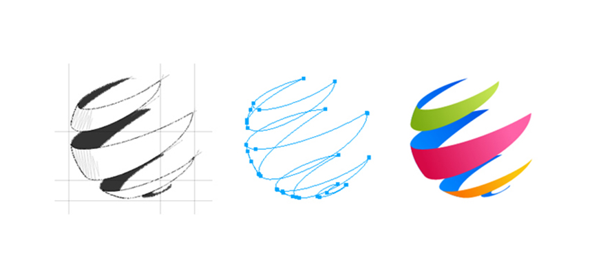
EXPECTATIONS OF YOUR COMPANY IDENTITY (LOGO)
What are our expectations when it comes to creating our company identity – LOGO? Generally, people expect the following from the logo design.
More samples to see which is good
Font styles and its size typically
Colors that are used – either transparent /dark colors
Specific number of letters or characters
Logo type – font based or with symbol
Position of the symbol & its connections to letters
The above expectations are quite common in nature when someone designs a logo and in fact the above requirements would be met default by a designer with minimal knowledge. The most interesting and critical fact is not the logo design and how it is designed? Its all about how we create an identity for a company or for a brand. Millions of designers who work exclusively just designing the logos around the world. All their concepts of design will get published sooner or later thru online. Our design concepts should not conflict with the existing identities. Our ideas should not be same as that of someone who had thought already and designed and delivered and published it. Overall our design should be free from the plagiarism of existing designs. Sometimes, post designing the logo we might encounter that its already exists in complete or to an extent. Hence a professional & experienced designer mostly cross check the piece designed with the published ones.
The thought process that we need to put in while creating a business identity involves much of our time, money, effort and our dedication. We need to understand the background of the business and the objective of designing a logo. More than a logo one should focus on creating a corporate identity for his/her business/products/services because the corporate world always compares them either with their financial strength or it thinks in specific to its symbols and identity that are represented visually. The corporate identity enables any business to travel faster and as well to penetrate the markets quicker. Some of the worlds best corporate identities and their designs have done well and have surprised their competitions to nightmares with its rapid growth and market share. The now fortune 100 & fortune 500 companies are known to be the best and top brands in their verticals and easily any body could recollect its visual representation of its products/services in terms of its logo design.
So, what do they focus on when designing their logo? What would have been their expectations when designing their corporate identities? Let us see now each of the possible expectation that one should have in creating a corporate identity and its rationale.
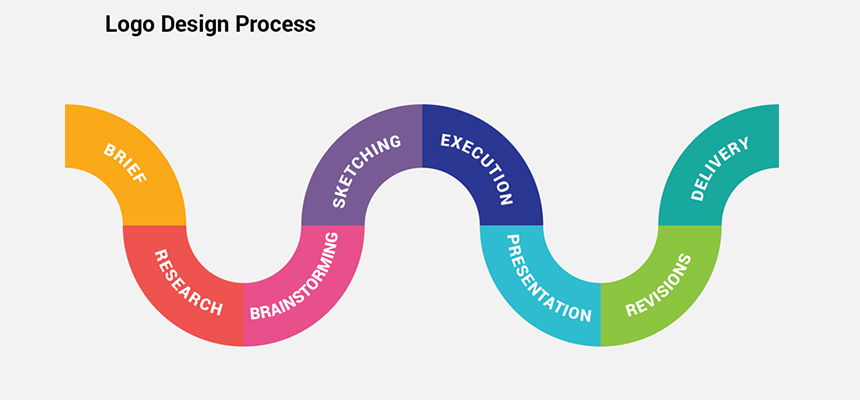
Create a corporate identity and not just logo
A business unit which is gearing up for rebranding or when it is in start-up stage, should envisage about its brand and its long-term benefits and purpose. Rather than just creating a logo, it should spend valuable time in huddling internally with their team and if possible work out a concept and its objectives in detail before the designer sketches it. The responsibility of the business owners or it management is greater than any other stake holder of the company when it comes to form a concrete structure of the concept of visual representation of a product/service.
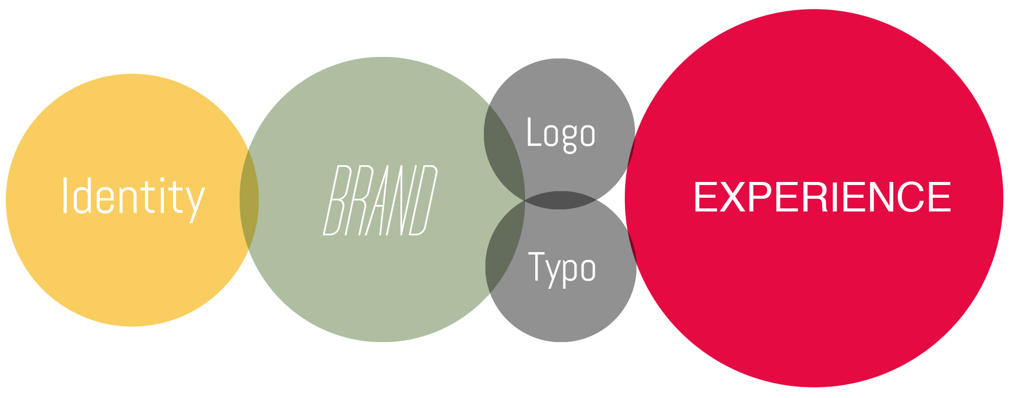
Minimal to an extent
The name or the identity should be minimal to an extent rather than a lengthy one unless otherwise the concept or product or service demands it for sure.
A Creative design
The designer should think out of box for the concept provided by the business unit. The design should conform to 100% of the requirements floated by the company in all aspects. No single stone should be left alone when it is in the design phase as even a small pinch of error even if it’s unintentional would harm the process of complete branding exercise. The design should be in fact more creative and universally in line with the long-term marketing plan and relevance of drifting customer towards its brand.
A representation of our business/products/services
The corporate identity should visually represent the product + business (or) the service + business perfectly as a whole.
Neat & Simple design
Clumsier the logo, it looks awkward when it is seen from different angles and it infers different perspectives of the company. Hence the design should be with more clarity in nature and depict the oneness of the brand/company in total.
Some interesting connecting symbols/Marks
The design should not only just focus on simplicity but also on connectivity of its target audience.
Eye soothing colors and its relevance

It’s obvious that colors play a vital role in the identity creation but that doesn’t mean we can embed any colors as we like and with any intensity and with no relevance. Every single-color code that comes in the design should have a strong relevance to it products/services/business/customers/ markets that’s been planned to target and pursue for a long time.
Free from plagiarism
The identity should be free from existing design that are available online and the designer should check from all available sources that its free from plagiarism.
Good to go for Trademark Registration
The designer ultimately should vouch and confirm that the pattern is good to go for trademark registrations after all required checks from valid resources.

